As soon as we moved in I tried to pick a colour for our bedroom with my mother in law. I bombed out with the stupidist shade of blue (Everest breath). It looked lovely on paper. Kinda mysterious and neutral and cosy. Looked awful once I painted a sample pot on the wall.
M and I know, in theory, what colour we want our walls through the whole house. Its the colour that a friend of mine has her walls painted (the friend from this recent post, in which you can see her walls). (That is probably our first mistake. Thou shalt not convert thy neighbors goods). Friend is renting, so has no idea what the actual colour of her walls are, so m and I are trying to replicate it from memory. (Second mistake. Everyone remembers things differently.)
 |
| WHICH COLOUR IS IT? |
We look at samples at night, in different rooms. We look at samples during the day, in different rooms, at different times of day. We bicker over the massive difference between gray and mushroom. I wonder if maybe we should do all our rewiring now, since that will change how we view colours.
 |
| Enya. You know you've made it big when you're not just an artist, but a paint colour. There's also a colour called Slim Dusty. Meanwhile, Restful Place seems an apt description of where M probably wants to put me as we split hairs over paint colours. |
Colour #2 came two weeks later, and was called Montpelier and seemed close to the ideal. I showed two female friends our top 3 colours and they both separately picked Montpelier. Female friend's opinions carry scientific weight. I painted little samples all through the house, in every single room except Willow's bedroom, the laundry and the bathroom. I painted it in several spots along the hallway, just so we could see how it looked in every light. $6 of sample pot later, it looks like freshly poured cement got smeared on our walls. Urgh.
I spent a lot of time watching paint dry and thinking maybe it will get lighter when dry?
 |
| On our well lit and well worn kitchen bench. I'd say this photo is fairly accurate. |
Colour #3 is lighter and called Morning Coffee. It's less mushroom gray and more beige. I tried to move away from the cement-ness of Montelier and picked a shade that looked a fraction lighter and warmer on my collection of swatches. I ended up with a colour that is the mere breath more gray than the current cream walls and is totally different to Montpelier.
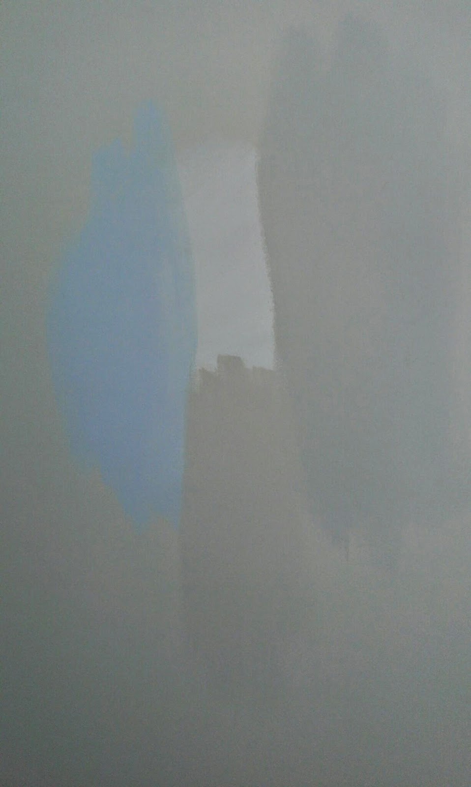 |
| Blue- Everest Breath. The white is plain ol' untinted paint. Below the white is Morning Coffee, and to the right is Montpelier. Around it all is the current colour of the walls. |
This time around, I spent a lot of time watching paint dry and thinking maybe it will get darker?
 |
| This... pretty much sums it all up. |
M and I sat down with all the samples again. At this point, picking the perfect colour for our walls has become picking at a scab- painful, but you just can't stop it. In the days since, Montpelier has kinda grown on me, the more I look at it. If only it was a little lighter. I mean, the sample pots are matt, and we're going for a semi gloss, so it would look a little different. More sophisticated and less concrete. Right? Plus, we look at the sample card for Montpelier and Morning Coffee, and those two look so similar on paper, and then you wonder how these other paints come out, and arrragh.
 |
| The two colours in question, in full sunshine. The difference is more obvious here. |
 |
| Around the silver switch is Montpelier. Below it is Montpelier at half tint. The wall has been painted with two coats of white under coat, so it's as white as white can be. |
 |
Hipster's rejoice! (Rejuice?) FYI, kale is totes not that colour. I'd call this "army trunk green."
|
"Nope."
Then we sat down to watch paint dry, again. I don't think our neighbours have to worry about us being that sort of young couple, the type you end up ringing the police about and complaining about to other neighbours.
 |
| This is what it all looked like after one coat. For us, it was pretty fascinating stuff. |
"I did two coats on that wall. It'll darken after another coat."
"I guess. And you did it with a paint brush so it went on thicker."
Silence as we continue to review the walls.
"Are you sure we got the right colour? Because it looks exactly the same as Morning Coffee over there."
"It's just the lighting. I mean, that other wall you painted looks a lot greener."
 |
| Montpelier on the left, plain white in the middle, Morning coffee down the bottom, on a hallway wall. |
Who knows what she's thinking about the entire process? She sees us go to the home improvement store, argue over identical colours, come home, argue over identical colours some more, and then sit and watch paint dry together. Meanwhile, every time she wanders into the kitchen to check in on us, we shriek at her to getoutdon'ttouchanywallsagain!
"I haven't. I won't," an offended Willow tells us. "Now can I please watch tv?" But you did once kid. As your parents, we can't ever let you forget that. She's since been trying to turn the situation to her advantage.
"You know mummy," Willow casually mentions, after complaining she's just so bored without tv. "If we had a tv in the hallway, I could watch tv without having to go in the living room... or if I had a tv in my room..."
 |
| The freshly painted walls. I don't know if you heard, but it's Montpelier :P The wall on the left used to be one of our red suede ones. You can see after a sand, two coats of a thick stain blocking undercoat, and two coats of paint- it's come up exactly the same as our other walls. |
 |
| Desk got turfed. Cube bookcase got swivelled around into the corner. Shag rug, which was a gift from M's mother, stays until I can bring myself to go into the shed and drag out my normal rug. It's raining this weekend. |
I actually quite like it still, because it's a bit of an unusual colour. I don't know anyone with teal upholstery in their house. M wonders what's the point of caring about the colour when I always have it covered in throw rugs- throw rugs which compliment the couch and are much easier to wash, thank you very much.
 |
| Without the desk, this bit of wall seems so much... fresher. Or maybe it's the paint? That aircon unit is becoming more and more of an eyesore. New debate: brick it over, or add in a window there? Office chair is standing in for arm chairs, which is another discussion- save up and get two arm chairs, or save up for a sectional lounge to wrap around this corner? |
 |
| To wallpaper, or to not wallpaper? We originally tentatively thought wallpaper, because it saved sanding one wall, and would look smart as a feature wall. Then I did the maths and realised we needed like 11.5m of wallpaper... and wallpaper comes on 10m rolls. Because of course it does. But if you look at the wall- see that little slither of wall not covered by wallpaper? That is literally what why we need a little bit more wallpaper than what comes on the roll. I've suggested sanding that strip back and painting it white or black. Hell, if we go black, maybe it could go over the suede directly and no one will notice? It's behind a door, after all... M was against it. Then we realised that we'd have to sand the wall anyway if we were to wallpaper, so urgh. But a feature wall could still look pretty awesome... Or maybe we should spend that money on a sky light? What a grim and dark hallway we have at the moment... |
 |
| M suggested we paint this wall a darker colour, so the tv stands out less. I screamed and said no more feature walls. But, at the end of the day, if he wants to do it... we will see. We will both think it over. We've left that wall unpainted for now. I've suggested that since he's thought of going REALLY dark, why not go all the way and paint it with chalkboard paint? It seems like a fun and interesting idea.... until we want a plain wall like all the others and find ourselves having to sand a wall again, I guess. We haven't painted that wall in the kitchen/ dining either, as you can see by the fact we still have a sample up on here. The reason is... we have plans for the kitchen. Eventual plans, but plans nonetheless. So why paint when we might just have to touch it up again later? |
 |
| Need a fancy door mat. Also planning on spray painting that door white, one day. And maybe rendering that exterior brick white too? |
 |
| Another former red suede wall. Note the new power point in the bottom right. It's... just so nice now. The plant on the table isn't just because I love indoor plants- it serves a purpose. Underneath my fabric table cloth, I have rug stop to stop it sliding. I need to get some more to go between the clear table cloth and the fabric table cloth (hence the table runner on top of it all- so you don't see the rug stop) to further reduce any slide. Rug stop is designed to stop rugs moving around on floors- a rubbery friction reducer. (That... sounds filthy). Then the heavy pot helps to weigh it all down- so any young children who might grab at the tablecloth are very unlikely to pull down plates or hot drinks. |
It feels so clean and serene in here now. I don't know if that's due to the wall colour, or the fact it's been so messy for for long and now it's actually clean and tidy.... But it's nice. Really, really nice. I'm really looking forward to seeing how this room will look with curtain rods up and pictures on the wall- the finishing touches. I'm especially keen to get rid of that old blind over the sliding door :)
You can see a progress shot of the dining room here, with base paint on the walls and the old cream trim (doesn't the white look so nice!) Meanwhile for the living room, we have progress shots here and here. You can also see how it looked seven days after moving in... or how it looked on day zero :P
So, back to the ol' to do list:
Sooner:
Repaint.Something with that study desk.- Down lights.
Later:
- Lace curtain instead of the Venetian blind. .... Although now I'm thinking three smaller venetian blinds....
- Verticals removed, and replaced with a curtain.
Trim needs doing.(Mark also did the skirting boards in one glorious hit. Over and done with!)- Rods.
- New rug/ shift another rug in.
- A coffee table.
- Plants.
- Heating.
- Pictures and art on the walls.
No comments:
Post a Comment